
Restaurant site that makes the case for ordering direct instead of through an app
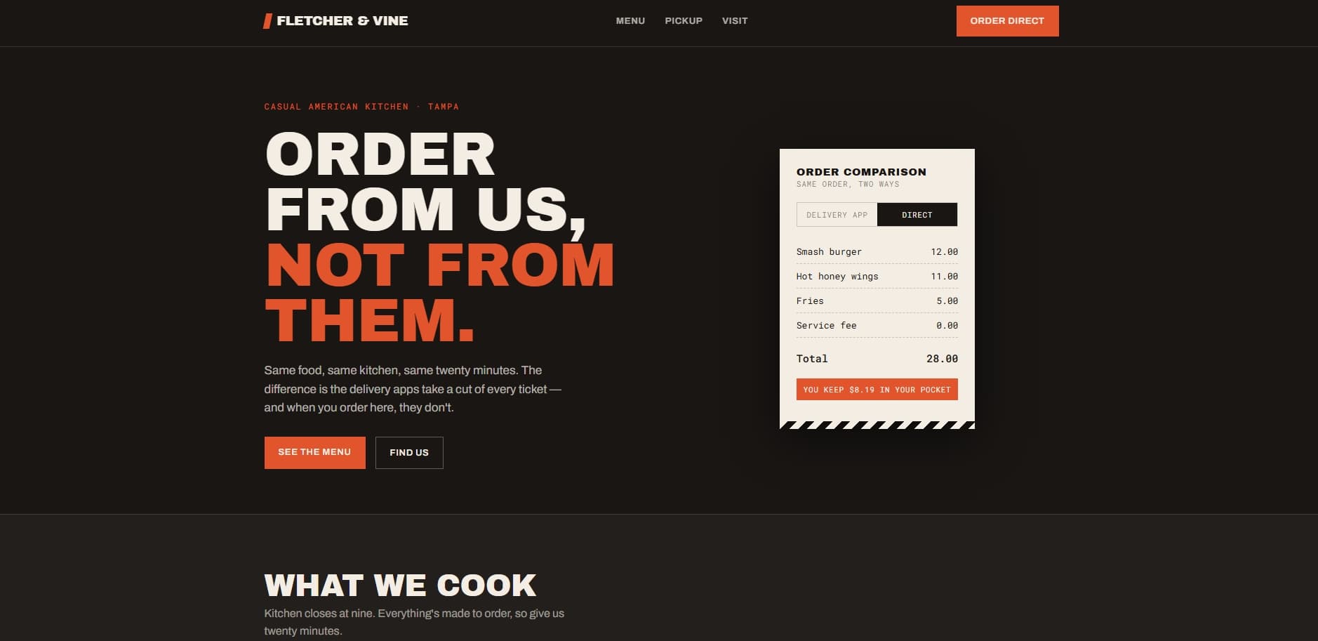
A restaurant's site is usually a PDF menu from four years ago and a phone number, so every order routes through an app charging heavy commission. The restaurant ends up paying rent on its own regulars.
The signature element is a receipt that toggles between "delivery app" and "direct" and recalculates in front of you — same three items, two totals, and the difference stated in dollars. It makes the argument in about three seconds, which no amount of copy about supporting local business manages. The rest of the page stays deliberately quiet so that one interaction carries the weight: dark smoke, a single ember accent, and a menu laid out to be read rather than downloaded.
Interactive receipt comparing app pricing against direct pricing
Menu that reads like a menu, not a downloadable PDF
Curbside pickup explained as three concrete steps
Hours and location structured for search and map results
Start with the plan — free, and yours to keep either way.