
Family medicine site where booking an appointment replaces phoning one
Most practice sites list services and hours, so every interaction still runs through the front desk by phone. Staff spend the day scheduling instead of caring for the patients in front of them, and anyone unwilling to sit on hold quietly goes elsewhere.
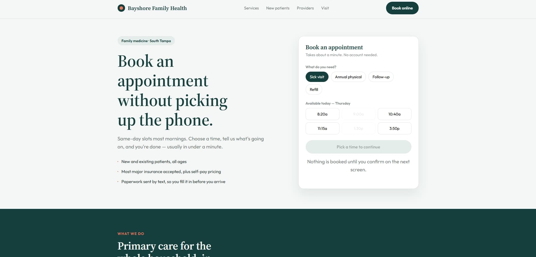
The booking widget is the hero rather than a link buried in the nav, because getting an appointment booked is the entire job of the page. It's interactive from the first second: pick a reason, pick a slot, and the button updates to confirm exactly what you're booking. Everything else — services, providers, new-patient steps — sits beneath it as reassurance rather than as the main event. The palette avoids clinical white in favour of a soft teal and coral, so it reads as calm rather than sterile.
Booking widget as the hero, not behind a Contact link
Reason and time selected before anything is submitted
New-patient flow with forms sent by text before the visit
Provider profiles so patients know who they'll actually see
Services grouped by what patients search for, not by department
Start with the plan — free, and yours to keep either way.